Display
You can use the blocks in the Display category to design the screen of the TXT 4.0 Controller and make it easier to use. This requires two steps:
- Configure, which means
- open a new file in the Display category using the Pages symbol with the plus sign at the top left
- drag the desired items to the screened area (this represents the configurable part of the display)
- adjust the specifications as needed.
- Program, which means
- program the interactions with the display in the main program using the blocks in the Display category.
Blocks
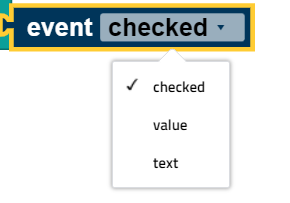
Event request
The event block [] opens the return value for an element. This block can only be used in the event programs. In these event programs, the block automatically relates to the event in whose program it is used. You can select the suitable type for the return value using the drop down menu (small triangle):
Label field
You can use the label field element to place a text on the screen. The symbol in the display configurator is the label. Drag this symbol to the screened area to open a window at the right side. Here, you can use Inspector to define
- the size of the label field in pixels,
- the position of the label field in pixels (the top left corner of the text field is at the given point),
- the name of the label field, and
- the content of the label field (this text is shown when the Display is started).
You can use the block set label field text ... to change the text shown in the course of the program.
Submissions
The inputs element allows users to enter text via the Controller. The associated symbol in the display configurator is the “T” character. Drag this symbol to the screened area to open a window at the right side. Here, you can use Inspector to define
- the size of the input field in pixels,
- the position of the input field in pixels (the top left corner of the input field is at the given point),
- the name of the input field, and
- the content of the input field (this text is shown when the Display is started)
You can use the block set input field text ... to change the text shown in the course of the program.
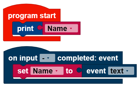
Input program
The input program runs when an input is complete. It is written separately from the main program. Variables work globally across both programs. The input program runs in the block when input is complete. The event [] block is set to “text” in the input program. In this example, the variable name is set to the entered text; it is then used in the main program to output the entered text :
Measurement instrument
The measurement instrument function can display values (no values below 1). The associated symbol in the display configurator is the scale. Drag this symbol to the screened area to open a window at the right side. Here, you can use Inspector to define
- the size of the measurement instrument in pixels,
- the position of the measurement instrument in pixels (the top left corner of the measurement gage is at the given point),
- the name of the measurement instrument,
- the alignment of the measurement instrument,
- the value range which the measurement instrument shows, and
- the value of the measurement instrument shown when you start the display
You can use the block set measurement instrument to value ... to set the measurement instrument to the entered value. This value should be within the pre-defined value range. If the value is outside of the value range, then one of the limits of the value range is shown depending on whether the value is too high or too low.
Status indicator
The status indicator displays the activity of something. Depending on the status, it will be illuminated (“active”) or not (“inactive”). The symbol in the display configurator is an illuminated diode. Drag this symbol to the screened area to open a window at the right side. Here, you can use Inspector to define
- the size of the status indicator in pixels,
- the position of the status indicator in pixels (the top left corner of the status indicator is at the given point),
- the name of the status indicator,
- the color of the status indicator, and
- whether the status indicator should initially be active or inactive,
Use the block set status indicator active [] to activate or deactivate the status indicator. You can choose whether the status indicator should be set to active or inactive using the drop down menu (small triangle).
Slider
The slider indicates values based on its position. The user can change the position using the touch screen. The value can be accessed using the event [] block once the slider stops. The accessed value is a decimal number. If you want a whole number for the slider value, you must use the round block. The associated symbol for the slider is a line with a circle. Drag this symbol to the screened area to open a window at the right side. Here, you can use Inspector to define
- the size of the slider in pixels,
- the position of the slider in pixels (the top left corner of the slider is at the given point)
- the name of the slider,
- the activity of the slider,
- the alignment of the slider,
- the value range covered by the slider, and
- the value at which the slider will be set when the display is started
You can use the block set slider value ... to move the slider to another value.
You can use set slider activated [] to change the activity using the drop down menu (small triangle).
Slider program
The slider program starts after the slider has been moved. It is written separately from the main program. Variables work globally across both programs. The slider program runs in the block on slider moved. The event [] block is set to “value” in the slider program. In this example, the speed of the motor is controlled using the slider. The value of the slider must be rounded, since the motor only accepts whole numbers for the speed:

Button
The button is a labeled field that can be pressed. If you press the button, the button program will run once you release it again. The associated symbol for the button is the square labeled “OK.” Drag this symbol to the screened area to open a window at the right side. Here, you can use Inspector to define
- the size of the button in pixels,
- the position of the button in pixels (the top left corner of the button is at the given point),
- the name of the button,
- the text shown on the button, and
- the activity of the button.
You can use block set button activated [] to change the activity using the drop down menu (small triangle).
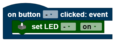
Button program
The button program runs when the button is released. It is written separately from the main program. Variables work globally across both programs. The button program runs in the block on button clicked. The event [] block cannot be used in the button program, since the button has no return value. In this example, the LED is activated when the button is pressed.
Switch
The switch can be in one of two positions, and is always in exactly one of these two positions. It returns true or false , depending on its position. The associated symbol for the switch is the oval with the dot. Drag this symbol to the screened area to open a window at the right side. Here, you can use Inspector to define
- the size of the switch in pixels,
- the position of the switch in pixels (the top left corner of the switch is at the given point),
- the name of the switch,
- the text shown beside the switch,
- the activity of the switch, and
- the status the switch should be in when the program is started
The block
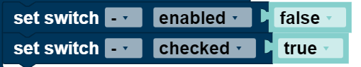
takes over two functions. You can set the activity (select enabled in the drop down menu) or the status (select checked in the drop down menu) to either true or false.
Switch program
The switch program runs each time the switch is moved from one setting to another. It is written separately from the main program. Variables work globally across both programs. The switch program runs in the block on switch toggled. The event [] block is set to “checked” in the switch program, it returns the values true or false . This example program turns the LED on when the switch is toggled; otherwise, the LED is turned off:

Checkbox
The checkbox can have one of two statuses, and is always in exactly one of these two statuses. It returns true or false , depending on the status. The symbol for the checkbox is the square with the check mark. Drag this symbol to the screened area to open a window at the right side. Here, you can use Inspector to define
- the size of the checkbox in pixels,
- the position of the checkbox in pixels (the top left corner of the checkbox is at the given point),
- the name of the checkbox,
- the text shown beside the checkbox,
- the activity of the checkbox, and
- the status the checkbox should be in when the program is started.
The following block takes over two functions. You can use the drop down menu (small triangle) to select which of these you will use. You can set the activity (select enabled in the drop down menu) or the status (select checked in the drop down menu) to either true or false .

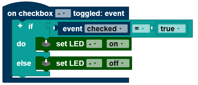
Checkbox program
The checkbox program runs each time the checkbox is pressed. It is written separately from the main program. Variables work across both programs. The checkbox program runs in the block on checkbox toggled. The event [] block is set to “checked” in the switch program, it returns the values true or false . This example program turns the LED on when the checkbox is checked; otherwise, the LED is turned off.